
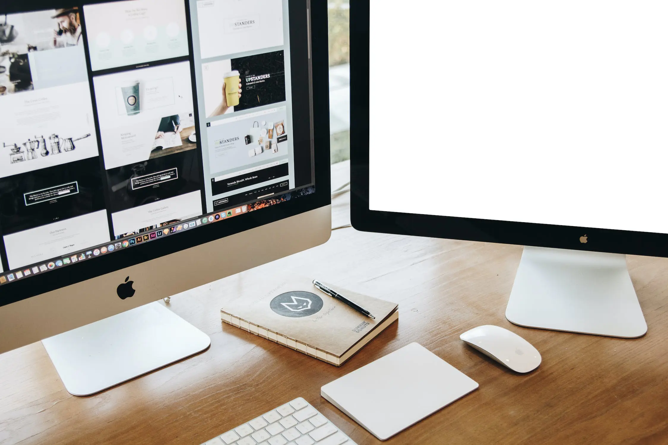
There is no denying the importance of having a website, regardless of the service or products you provide, or the industry that you work in. If you want to have an online presence, you need to have a website. However, not all websites are good websites, and there are a lot of bad web designs out there. Though this might not seem like a big deal initially, bad web design can have a huge impact on your traffic, leads, sales and revenue. With an excellent website, you have everything that you need to succeed online, but bad web design can hold you back.
Of course, it’s not always easy to know if your website needs improving, especially if you’re somewhat of a web design novice. Luckily, we are here to help. Below, we have listed six of the ways your website might be badly designed, and what you can do to improve things.
Confusing Layout
One of the biggest signs that you have a bad web design is if the layout is confusing. Certain conventions and standards exist in the world of website development, and they exist for a reason. If you go against them or try to be too clever, you run the risk of alienating your target audience. Your website should have a layout that’s easy to use, navigate and understand. First time users of the website should be able to understand where everything is immediately, and they shouldn’t struggle to find what they are looking for.
Incompatibility
You only have to spend a minute or two researching a bad website example, and you will see that incompatibility is often one of the first things mentioned. Incompatibility between mobile and browser is a huge problem for websites, and failure to use a responsive design can really hold your online presence back. A website should be easy to use on whatever device it’s being viewed on, whether that’s a large computer screen or a small smartphone. Images, text and graphics should all change to fit the individual screen that’s being used, making sure that everyone gets a flawless website experience. A bad web design is one that doesn’t work equally well on various screen sizes.
Bad Use of Colour and Space
When it comes to using colour on a website, sometimes less really is more. A lot of websites have too many colours, making the entire page feel busy and garish, which can make text difficult to read and the website unpleasant to use. However, you also want to avoid having too much whitespace, which usually means that the website design is not engaging or interesting to a user. It’s a case of finding a balance between the two; a website should be bright and bold, without being over the top and too loud. Though making your website vibrant and lively is tempting, the use of colour and space needs to reflect your brand, business and industry.
No Calls to Action
A lot of bad web designs are lacking calls to action, which should be dotted around the website and clearly visible to users. Calls to action are there to encourage people to get in touch with your business, to find out more about a product or service, or to provide their details for you to contact them. Seeing a call to action is often enough to encourage a website user to take action, and it’s likely that you will get fewer sales and inquiries without one. This is because customers may be confused about how to get in touch or what you’re selling, or they simply might forget that getting in touch is an option. Seeing a call to action could be all it takes.
Ineffective Search
When someone visits a website, they want to be able to find what they are looking for quickly and simply, and in a matter of seconds. This could be because they are searching for an exact product or service, or because they are looking for a specific piece of information. Many websites make it difficult to find what you are looking for as they have a poorly implemented search function or no search function whatsoever. This can make using the website time consuming and difficult, and it reduces the chances of a potential customer finding what they need. With good search capabilities, users can find exactly what they are looking for without the risk of them becoming bored and heading to a competitor.
Hard to Read
One of the most common issues that websites have, and it’s something that can really deter visitors, is having text that is hard to read. This is usually due to the fact that text tends to look different on different devices, and it can be the wrong size or hard to read against a specific background. This is why it’s important to design a website with a range of devices in mind. Though a specific layout or colour of text might be perfect on a computer, it might not work quite as well on a smartphone or tablet. Not only does hard to read text negatively impact user experience, but it prevents a website visitor from easily accessing the information that they need. This could result in them taking their business elsewhere.
At Profici, we understand the importance of flawless website design and development, and we know the negative impact bad web design can have on your business. This is why we go above and beyond to create websites that stand out, make a statement and appeal to your target audience. We don’t simply create standard or generic websites, our aim is to create something unique, professional and fully branded.
It’s never too late to improve your website, especially if you’re now starting to wonder if yours might be badly designed. To find out more about our website design services, get in touch with our talented team of experts.

Latest Posts
-

The 4 Types of Corporate Strategy to Help Grow Your Business
-
Organic Growth for Your Business: What Is It & 9 Proven Strategies
-

Running a Successful Business: 8 Pro Tips
-

Become A Competitor ‘Mind-Reader’: How To Take Your Competitor Analysis To The Next Level
-
How to Stress Test Your Value Proposition: Delivering Uniqueness Versus The Competition
-
Nurture and Sustain Team Health
-
Prune Your Leadership Team to Encourage Future Growth
-

Three Ways to Build Great Teams
-

Welcoming Matt Lumb as the New CEO of Profici
-

What to do when you Miss your Sales Goals